


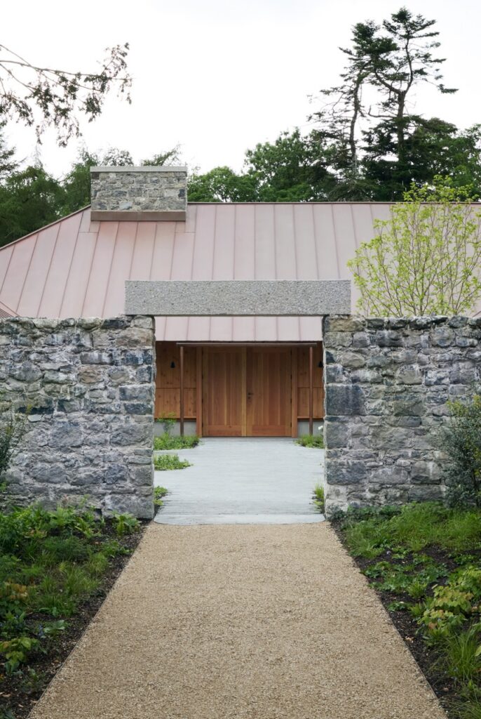
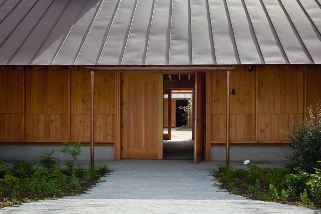
In March 2024, I visited the ruins of Millbrook House in Abbeyleix to begin work on a natural dye commission for Ómós Guesthouse and Restaurant. Cúán walked me around the overgrown grounds, showing me where the restaurant would go and spoke of his plans for the kitchen garden. He talked about his design and vision for the place while showing me the property’s crumbling mill & outbuildings. Nothing had been built except the Victorian shell of what was once a grand home. There’s something remarkable about standing in an empty field while someone describes their dream for it, and then, later, seeing that dream take form in such a thoughtfully executed way.
Ómós is a 16-bedroom guesthouse and restaurant in Abbeyleix, County Laois. Built around Millbrook House, a restored Victorian property on the edge of the town. Led by Cúán, Ómós means homage, duty, and respect in Irish. Rebecca
Norberg led the interior design at Relief Gallery alongside Copenhagen-based Asca Studio. They drew deeply on Irish
vernacular design and making, working with local craftspeople and artists throughout.
The site visit
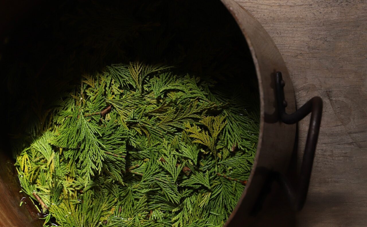
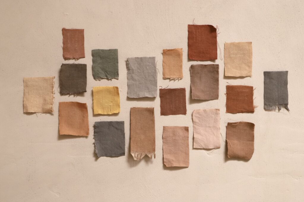
My initial task was to explore, document & create a palette from the property’s natural dye sources. When you are discovering plants in a space for the first time, there’s always an element of uncertainty. What grows? Is it a good dye source? Is there enough to create a strong dye with? The time of year & season always has a part to play. I was relieved to find an old walnut tree close to the house. Followed by willow, cypress, larch, yew, and hawthorn. Working within the season at hand, I focused on what the land offered. In the lingering grasp of winter, where the early days of spring are but a promise of what’s to come, I was relieved to return to my studio, excited to develop the colour from the grounds of Millbrook House.
Developing the palette for Ómós
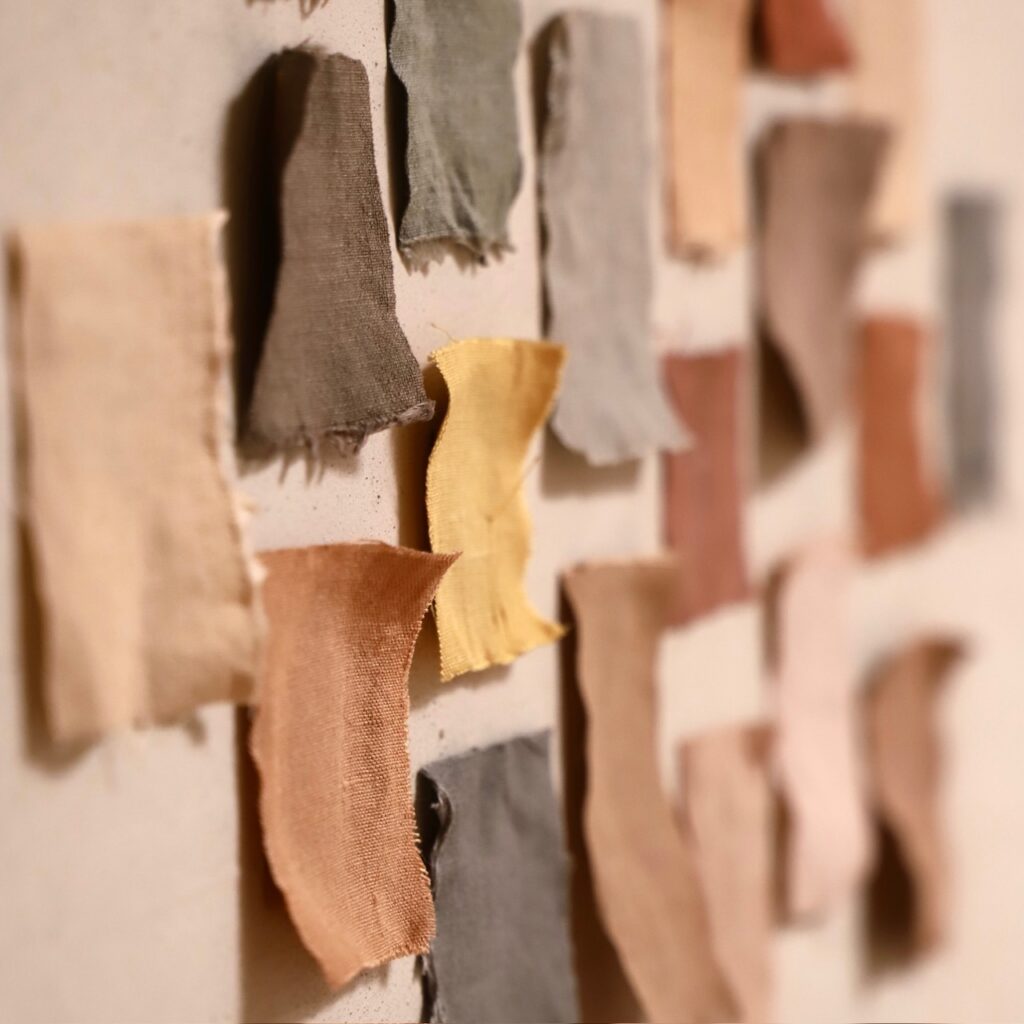
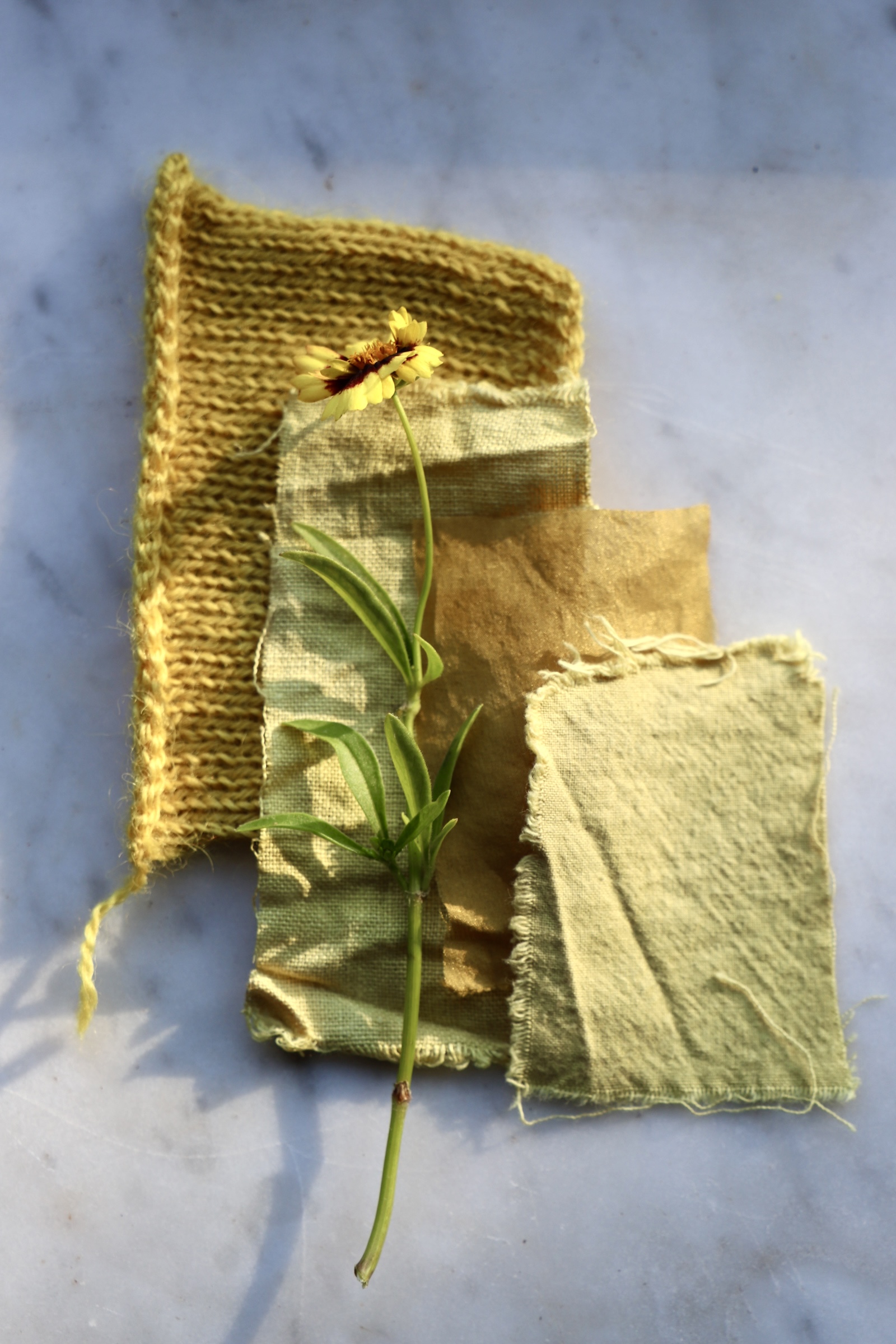
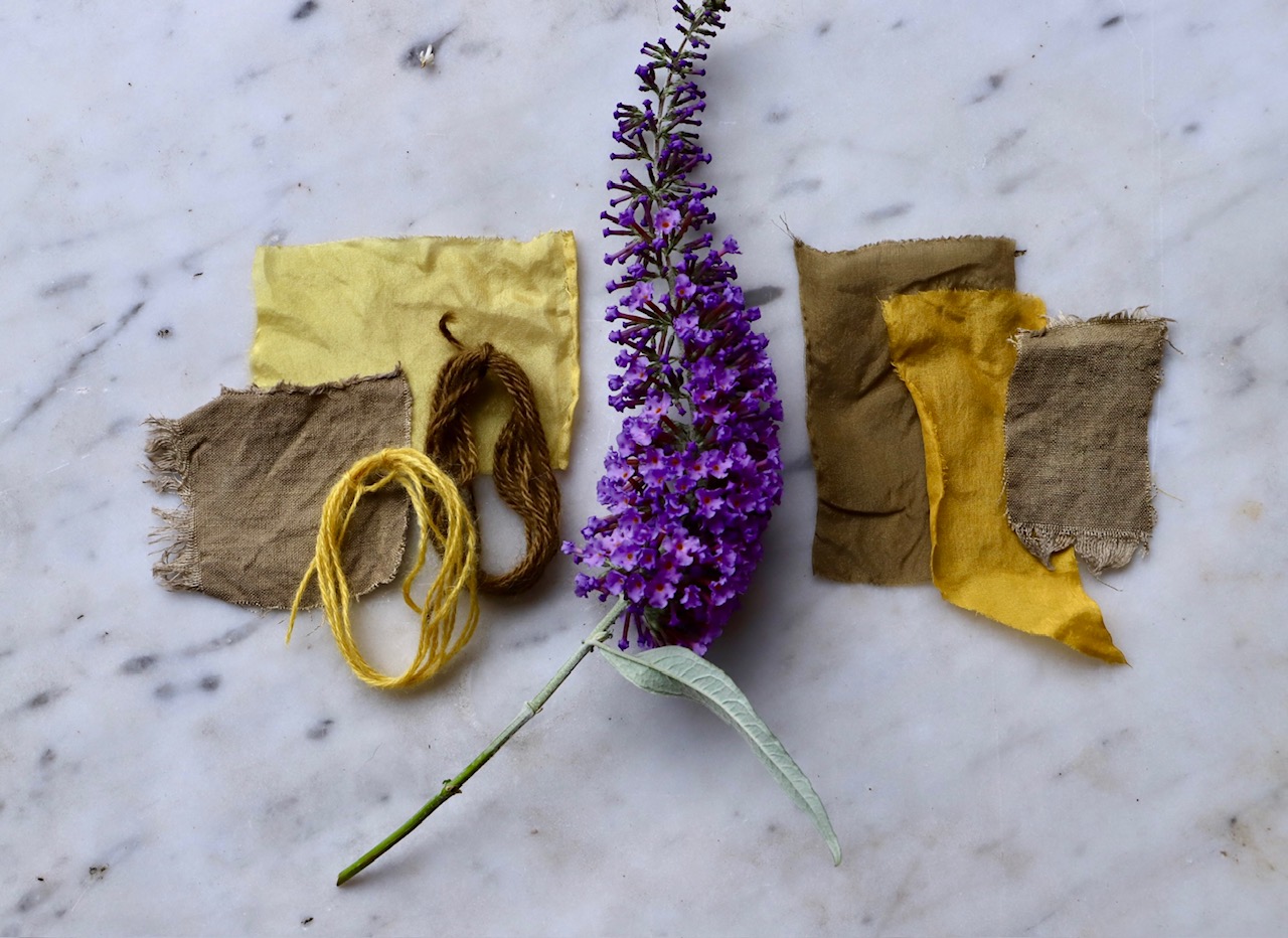
Back in the studio, I worked through each plant systematically, testing colour on both plant fibre 100% linen and 100% alpaca, from Ashford Alpacas in Wicklow. Natural dye has a real affinity for animal fibres; the alpaca took the colour beautifully, richer and more saturated than the linen with the same quantity of plant material. Anyone familiar with alpaca knows how luxurious a fibre it is, silky & soft; it is my preferred natural fibre of choice.
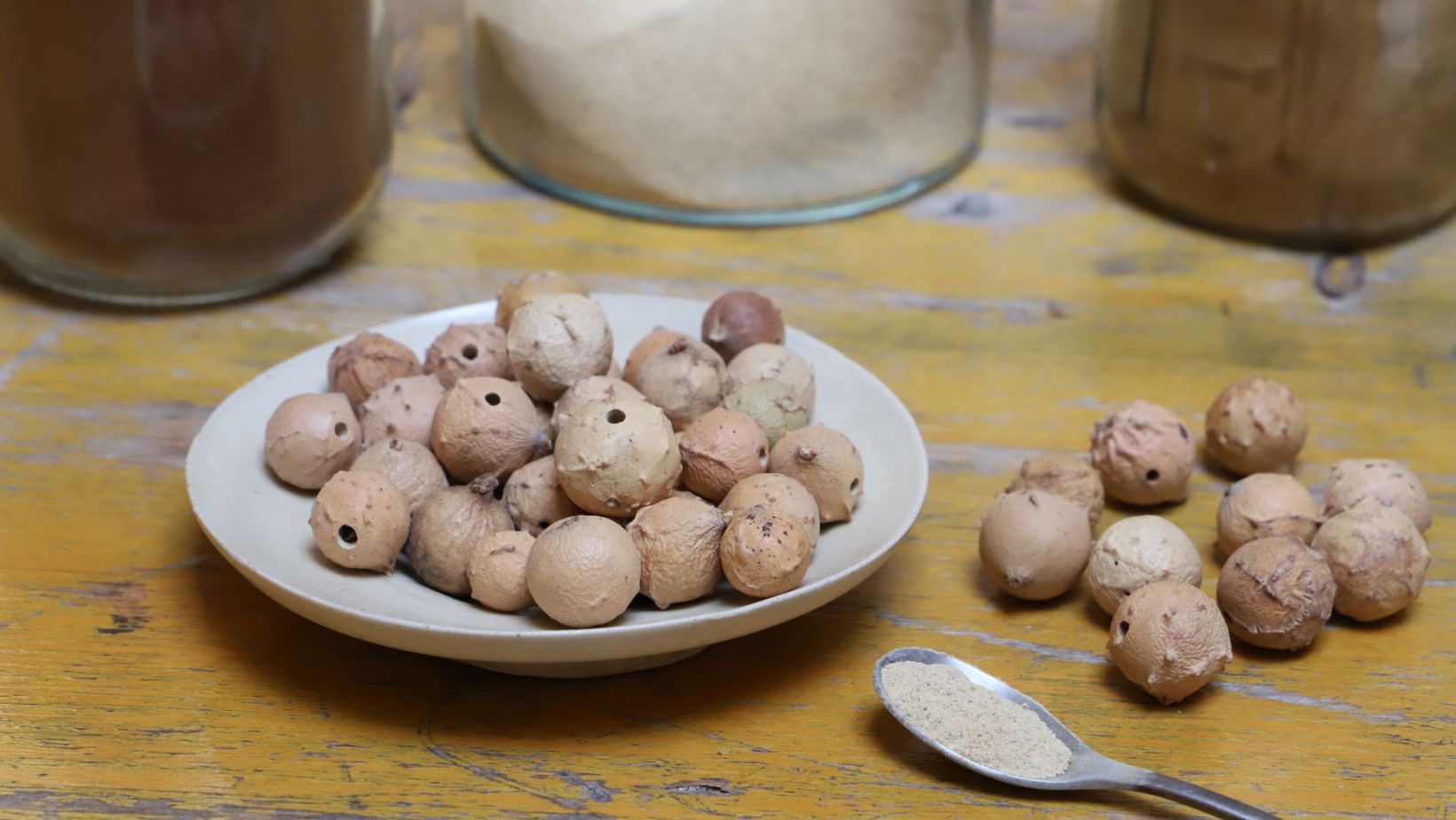
Walnut, willow, cypress, yew, and hawthorn all gave excellent, reliable colour. Larch was more difficult to work with. Cyprus was an absolute joy to discover for the first time! Walnut, a fantastic & historical source of natural colour, is always a treat. While walnut dye usually comes from the husks of the tree in the Autumn, similar lighter tones can be extracted from the branches later in the year. Willow & hawthorn are two of my favourite sources of natural colour.
The tones were earthy, varied and so very complementary. No surprise there; that is one of the elements I love most about working with natural colour. How effortlessly & confidently natural colour complements itself. I learnt after the fact that yew is poisonous to work with; this is how I discover most things in life, after the fact 🙂


Working with Relief Gallery
Once the palette was developed, I worked with Rebecca at Relief Gallery to bring the Ómós natural dye commission to life. She sent her ideas for the space; we talked through fabric, lighting, and texture. I created the final pieces based on her measurements and the tones she felt suited each room.




The Finished Ómós Natural Dye Commission
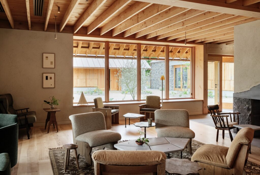
Two very different works came out of this. The piece for the main hall is silk, dyed with oak. The piece for the private dining room is heavily textured, dyed with hawthorn. Offering a softer, warmer feel, suited to a more intimate space. Alongside the two main pieces, there are a few framed collections of sample swatches from the different plants. These are dotted throughout the interiors of both the guesthouse and the restaurant. I live in a world of naturally dyed swatches; throughout my studio you’ll find them in stacks, here and there. It’s really satisfying to see how Rebecca took them and presented them in such a simple and contemporary way, which apparently helped inform the design process and colour scheme of the interiors. A testament to how she wove so many elements together to create a beautiful whole.
This is one of my favourite kinds of projects. Discovering site-specific natural colours, and bringing that back into a space. We often think of bringing the outdoors inside, so rarely in this way. If you’re thinking of a colour-site-specific piece, I’d love to hear about it.
Photos: Irina Boersma César Machado
Architects: Ryan W. Kennihan Architects
Interior architects: Asca Studio and Relief Gallery



+ show Comments
- Hide Comments
LEAVE A COMMENT